Paving the way
for an AI assistant.
Microsoft Cortana
Brand & Experience Direction
In 2018, well before the emergence of Copilot, Microsoft asked our team to explore the future of Cortana. The brief wasn’t about features. It was about presence: how an AI assistant could exist across devices, adapt to individuals, and support daily life without becoming intrusive.
We focused on designing an assistant that felt aware, personal, and restrained—one that understood when to step forward and when to fade into the background.
Client
Microsoft
Role
Art director
Visual designer
Scope + Deliverables
Logomark design
Visual design
Brand & key art
Motion prototypes
Timeline
2018
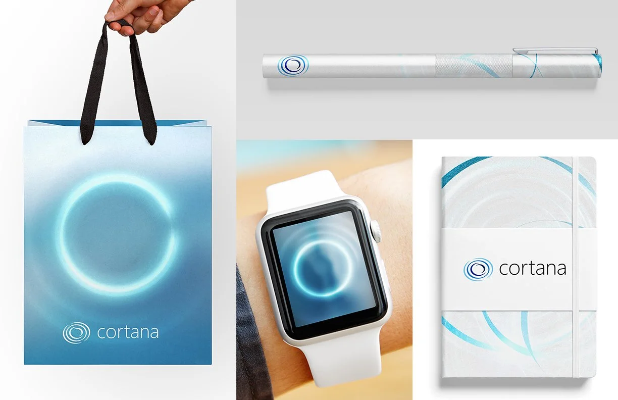
Brand direction 1
Force
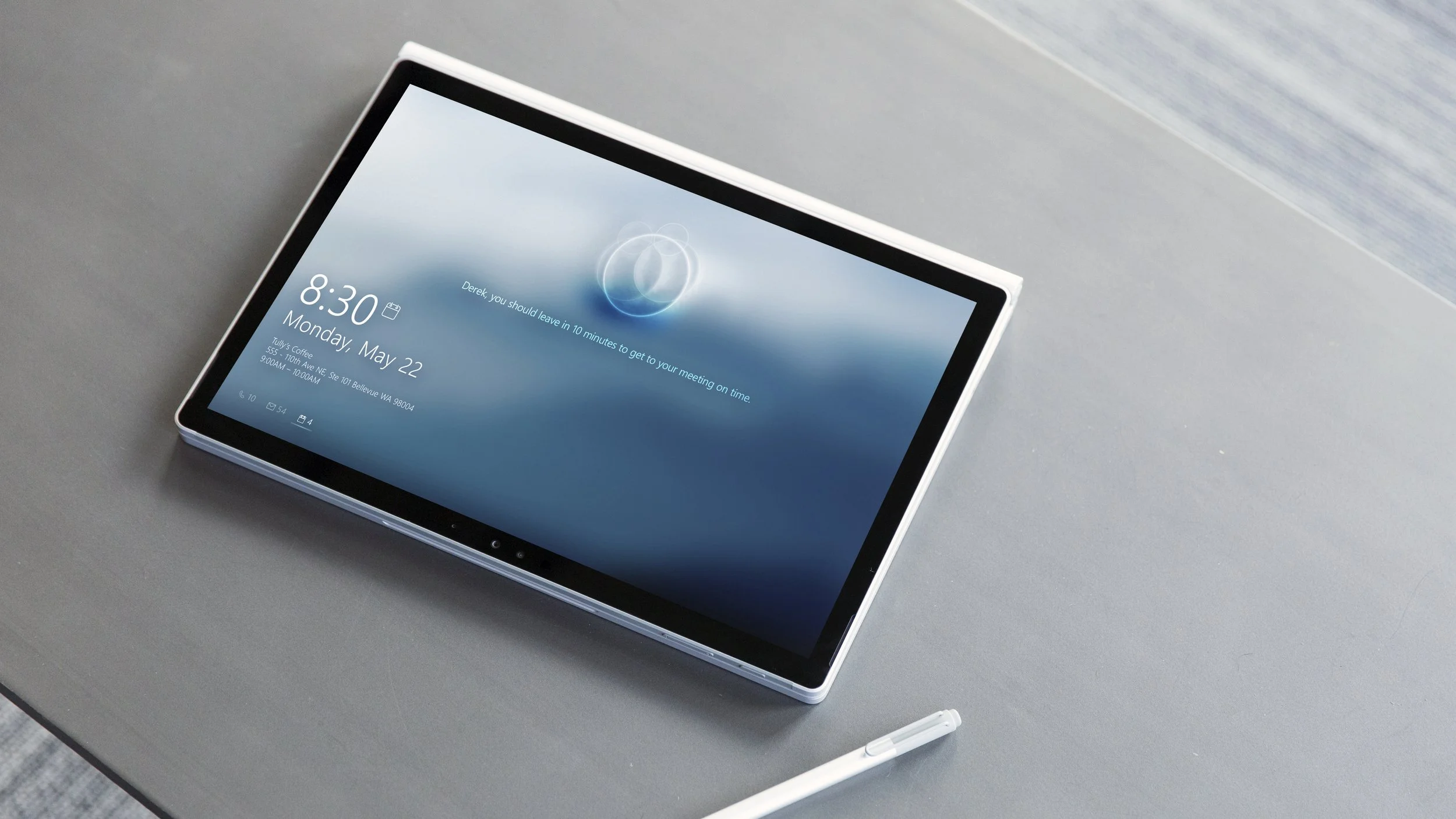
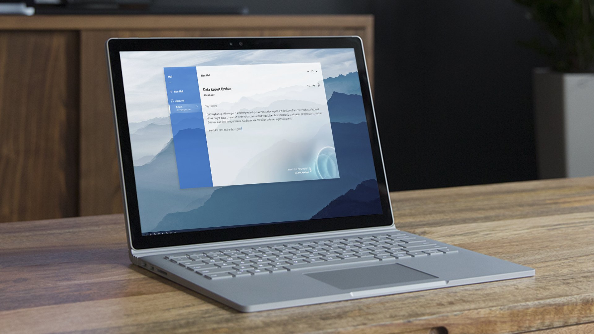
This concept explored Cortana as a living signal.
A soft, responsive ripple that subtly appeared across devices, shifting in tone and motion based on each user’s behavior. No two expressions were the same—reinforcing the idea that intelligence should adapt to people, not the other way around.
Brand direction 2
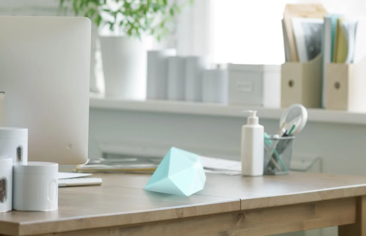
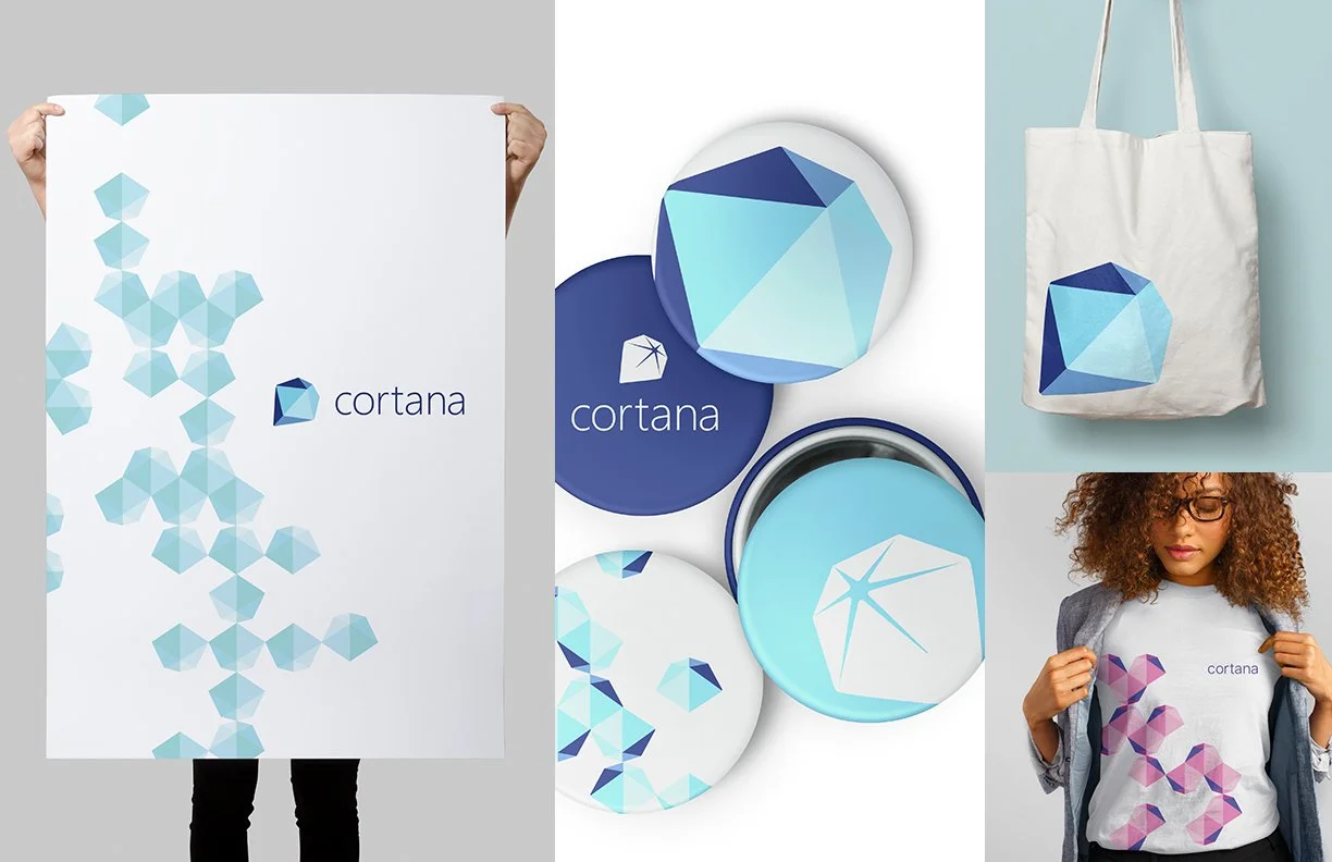
Prism
Prism introduced the idea of Cortana as both digital and physical—an assistant expressed through light, form, and material. This direction opened up new ways to think about AI as something that could belong in everyday environments, not just screens.
Together, these explorations helped define a more human, ambient vision for AI. One that prioritized trust, personalization, and restraint at a time when the category was still finding its voice.